
The release of iOS 18 has caused a stir in the tech world. iPhone users can finally fully customize their home screens and place apps as they wish. Particularly noteworthy is the ability to adapt app icons to dark mode. In this article, you'll learn everything about the new dark app icons and how they come about.
With the launch of iOS 18, Apple is breaking new ground in terms of customization options for iPhone users. While Android users have been able to make extensive customizations for years, iOS has lagged behind. That has now changed. In particular, adapting the app icons to dark mode is a notable step that is not only aesthetically pleasing but also improves the user experience. Let's take a closer look at how these dark app icons work and what's behind them.
Customization options in iOS 18
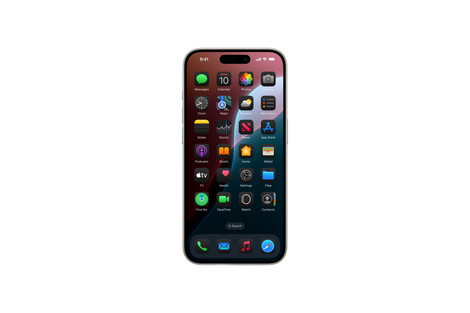
With iOS 18, you now have the freedom to place applications almost anywhere on your home screen. This was not possible in this form before. You can also color the app icons, which gives your iPhone a personal touch. These innovations set iOS 18 apart from its predecessors and offer you as a user extensive customization options.
Dark app icons in focus
A special highlight of iOS 18 are the dark app icons, which were specially developed for dark mode. These icons adapt automatically when you activate dark mode, which ensures a uniform and eye-friendly display. But how does it actually work?
The process behind the dark app icons
Loud According to Gui Rambo, a well-known developer, the process for creating dark app icons is surprisingly simple and is not based on machine learning or artificial intelligence but on pure mathematics. Apple's "IconServices" technology extracts the foreground graphics of the app and decides whether the background is tinted or not. Certain thresholds are used to ensure that the result is visually appealing.
Diverse results
The adjustments to the app icons vary depending on the application. On YouTube, the background changes from white to black, while Facebook's familiar "f" is changed to a light blue and the background is darkened to a darker blue. Instagram, on the other hand, only gets a darker tint because the icon is already quite complex. A rule of thumb here is: If two colors dominate the app icon, they are inverted or significantly changed in the dark version. This variety of results ensures a harmonious appearance in dark mode.
Dark app icons: Simple but effective in iOS 18
The new customization options in iOS 18, especially the dark app icons, mark an important step for Apple and its users. You can finally customize your home screen and take full advantage of the benefits of dark mode. Although the process behind the dark app icons seems simple, it shows how well thought out and user-friendly the new features in iOS 18 are. Get ready for the final release and look forward to an even more personalized and eye-friendly user experience. Are you looking for new accessories? Visit our Amazon Storefront and discover numerous products from leading suppliers, also for HomeKit and more! (Image: Apple)
- iOS 18: How to change app colors and themes
- Install iOS 18 Public Beta: Step-by-step instructions
- Installing iOS 18 Developer Beta: How to do it without any problems
- Delete iOS 18 beta and install iOS 17: Here's how